The Artists Who Turn Fruit Into Fashion: Inside the Creative World of Summer Fruit Bikini's Signature Prints
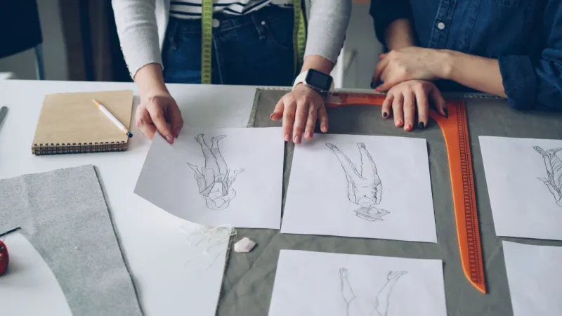
There's a moment, somewhere between a blank canvas and a finished bikini, where a piece of fruit becomes something more. A lemon stops being a lemon and starts being a feeling — a whole July afternoon compressed into a repeating pattern on stretch fabric. Getting to that moment takes skill, intuition, and a kind of creative obsession that most people never see.
We sat down with several of the designers and illustrators behind Summer Fruit Bikini's most beloved prints to talk about where ideas actually come from, what the process looks like from the inside, and why — out of all the things you could put on a swimsuit — fruit keeps winning.
"It Always Starts With Something Real"
For illustrator Maya Chen, who created the fan-favorite Cara Cara Orange scatter print, the starting point is almost never at a desk.
"I was at the Santa Monica Farmers Market in early spring, and someone had these blood oranges and cara cara oranges side by side," she recalls. "The color difference between them — one almost magenta, one this soft coral — I couldn't stop looking at it. I took probably forty photos before I bought any."
That afternoon, she went home and started sketching. Not the final product — just the shapes, the cross-sections, the way the segments curve inward. "I'm not trying to make something technically accurate. I'm trying to capture what made me stop walking."
This approach — starting from a genuine sensory experience rather than a trend report — is something you hear again and again from the artists in the Summer Fruit Bikini creative network. The best prints, they'll tell you, are the ones that started with someone actually loving a piece of fruit.
From Sketch to Swimwear: The Technical Side Nobody Sees
Designer and pattern artist Jordan Reyes handles what he calls "the translation problem" — taking a hand-drawn illustration and turning it into a repeat that works on a three-dimensional garment.
"A print that looks amazing as a flat image can completely fall apart on a bikini top," he explains. "You have to think about where the repeat hits at the bust, what happens to the scale when it's cut on the bias, whether the colors read differently when the fabric is wet."
For his most recognized design — the Heirloom Tomato print that sparked a surprising amount of debate about whether tomatoes count as fruit (they do, and we're standing firm on that) — the final repeat went through eleven different versions before it was right.
"Version three was technically perfect and completely lifeless," Jordan says. "The spacing was mathematically even, the colors were accurate. It looked like a textbook diagram. We had to go back and put the imperfection back in — the slightly wobbly stem, the variation in the red. That's what made it feel alive."
The Prints That Almost Didn't Happen
Some of the most popular designs in the collection came from unexpected places — and a fair amount of initial skepticism.
Illustrator Priya Nair created the Dragonfruit Dip-Dye print, which has become one of the brand's most-photographed pieces on social. Her pitch was met with some hesitation at first.
"The feedback was basically, 'Is dragonfruit too niche? Will people recognize it?'" she laughs. "And I said, every single person has seen a dragonfruit on Instagram at this point. We all know what it looks like. We just haven't worn it yet."
Priya's instinct was right. The print's hot-pink exterior bleeding into white with tiny black-seed speckles turned out to be visually unlike anything else in the collection. "The speckled interior was the whole challenge. Too many speckles and it looks chaotic. Too few and you lose the whole point. I probably placed individual dots for about three weeks."
Why Fruit? Why Always Fruit?
It's a fair question to ask the people who spend their professional lives drawing it. The answers are more varied than you'd expect.
"Fruit is universal," says Maya. "Everyone has a relationship with it. A lemon means something to you — a smell, a memory, a kitchen in summer. You can't say that about an abstract geometric."
Jordan thinks it's about optimism. "Fruit prints are fundamentally happy. They're not trying to be edgy or dark. They're just — joyful. And I think people are hungry for that, especially in summer."
Priya's take is more philosophical: "Fruit is the intersection of nature and pleasure. It's beautiful and it's meant to be enjoyed. That's exactly what a great swimsuit is supposed to be."
What Comes Next
Without giving too much away, the artists hint at some directions the upcoming collections are exploring. Figs are apparently having a major moment in the studio. There's been a lot of conversation about under-represented fruits — varieties that most Americans haven't seen on fabric before, from lychee to fresh tamarind to rambutan.
"The goal is always to make someone feel something they didn't expect to feel from a swimsuit," Maya says. "Recognition, nostalgia, curiosity — whatever it is. If you put it on and something lights up, we did our job."
Next time you pull on your favorite Summer Fruit Bikini piece, take a second to look at it differently. That pattern didn't come from a software template. It came from someone at a farmers market in the early morning, stopping in their tracks because a piece of fruit was too beautiful not to chase.